This video contains narration, please turn up the volume.
This project made me rethink what design exploration can look like when the medium is code.
EasyCook is a React Native app for recipe discovery, meal selection, and grocery planning.
The goal was to learn how to build a mobile app using React Native and Expo. But it turned into something more personal than that.
Where this came from
I moved to the US from Germany, and grocery shopping here caught me off guard. Back in Germany, I would buy what I needed for that night's dinner, maybe stop by the store on the way home, pick up some vegetables, done. But in the US, grocery shopping is a weekly ritual. You drive to the store on the weekend and buy everything for the entire week. That means you need to know what you are cooking for the next seven days before you leave the house.

Storyboard-1: Problem area

Storyboard-2: Proposed solution
I had never had to plan that far ahead. It felt like a lot of mental overhead for something that should be simple: I just want to eat good food.
So when we were asked to identify a problem space for our class project, this one came naturally.
I sketched out a quick storyboard: a person dreading their weekly grocery run, then the app generating a list and recipe cards, and finally that person leaving the store stress-free with exactly what they need.
I presented three problem areas to my classmates and we did a voting session. Grocery planning got the most votes. It wasn't just my problem.
Scoping the project
I wrote a project proposal laying out who this was for.
What & How: The app would combine recipe browsing with automatic grocery list generation, and use location services to suggest nearby stores.
Who: people in their mid-to-late twenties who are new to cooking independently, find grocery shopping overwhelming, or want to try new cuisines without the friction of figuring out what to buy.
The primary use case of checking your grocery list while walking through a store meant it had to be a phone app, not a website.
I set myself a regular goal and a stretch goal.
The regular goal was straightforward: search recipes, generate a grocery list without duplicates, suggest nearby stores.
The stretch goal was more ambitious, combine ingredients across multiple recipes into one clean list, and auto-group items by store section (dairy, produce, etc.).


The tech stack: React Native with Expo, Spoonacular API for recipes, and Google Places API for store suggestions.

Figma first, then into code
I started with some quick screens in Figma to get a feel for color, typography, and the general layout of the home screen. Nothing polished, just enough to have a direction before jumping into VS Code.
This was actually the first project where I didn't build out the full prototype in Figma before coding.
I kept going back and forth between paper sketches and VS Code, mapping out the user journey as I was building the app. That was new for me. Usually I would have the whole flow nailed down in a design tool first. Here, the design and the code were evolving together, and honestly, it was a more honest way to work.
I couldn't hide behind a pretty mockup. Every screen had to actually function.

When the code outgrew one file
The project was under control at first.
home screen setup, stylesheets, basic navigation. Then I realized I needed way more screens than I'd planned, and the single-file approach was becoming a mess. Scrolling through hundreds of lines just to find a button's styling was slowing me down.
So I restructured everything. I broke the code into separate .js files for each page, moved all the stylesheets into one shared file, and did a lot of file management cleanup (with help from Codex) so that anyone looking at the repo could actually navigate it.
After that, each file had a clear name and a clear job, the code for the home screen was in one place, the grocery list logic in another, the recipe detail view somewhere else. It sounds basic, but it made a huge difference in how quickly I could move.
Figuring out the API
Integrating the Spoonacular API was mostly straightforward, but one thing tripped me up. For the grocery list, I wanted to show users which section of the store an ingredient belongs to, like "produce" or "dairy", so they could shop more efficiently. I assumed this would be under a field called "category" in the API response. It wasn't. After reading through the documentation carefully I found it buried under a field called "aisle." Not intuitive, but it worked.

Snippet 1: Where the aisle becomes the subtitle the user sees

Snippet 2: Where the aisle data gets captured and preserved

The "ingredient alias" map
The grocery list merge problem
This was the part of the project I am most proud of, and also the part that gave me the most headaches.
Here's the problem: if a user adds four different recipes and all of them call for garlic, the grocery list shouldn't show garlic four times. It should merge them. But the data isn't clean. One recipe says "1 clove garlic," another says "1 tsp minced garlic," another says "3 cloves garlic," and another just says "garlic" with no quantity at all. The app needed to recognize that these are all the same ingredient and combine them into something reasonable, like "1 bulb of garlic."

The "normalize Name" function
I used Codex to help write the initial merging logic, but it took a lot of back and forth. Small edits, testing with different recipe combinations, edge cases where the normalization would break. It wasn't a one-prompt solution. It was iterative, messy work, which is kind of the point: the hardest UX problems in this app weren't visual. They were in the logic underneath.

The "combine Ingredients" function
1. Favorites vs. My Recipes
I separated these into two distinct features.
Favorites is a lightweight bookmark -
"this looks interesting, I'll come back to it."
My Recipes is a commitment -
"I'm cooking this, add it to my plan."
This distinction made the mental model clearer for users and also simplified what the app needed to track. Only "My Recipes" feeds into the grocery list.
Key design decisions

My Recipes page
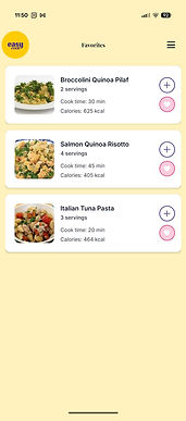
Favorites page
2. Multiple screens instead of one long scroll.
Rather than cramming browsing, saving, and grocery planning into a single experience, I used stack and drawer navigation to give each task its own screen.
Each screen had one primary job. It also made the code more modular, which mattered when I was debugging, I could isolate problems to a single file.
3. Grocery list indicating store aisle.
Once I figured out the "aisle" field in the API, I used it to label the list by store section. This meant you could work through the list as you walked through the store, instead of jumping back and forth between aisles.
What I took away
Before this project, I thought of code as something that happens after design. You design the experience, then you hand it off or build it. EasyCook changed that for me. Building the app myself meant every design decision had to survive contact with real data, real navigation constraints, and real state management. Some ideas I had in my head turned out to be impractical. Other ideas like the grocery merge logic only emerged because I was deep in the code.
I also learned that file structure is a design decision. How you organize your code affects how quickly you can iterate, how easy it is for someone else to understand your project, and how confidently you can add new features without breaking things.
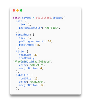
But the realization that stuck with me most happened when I was consolidating all my styles into one shared stylesheet. It hit me: this is basically a design system. What a design system is for a designer in Figma, a stylesheet is for an engineer in code. I was doing the same work, just in a different medium.
Since my entire project lived in code and not in Figma, I never formally built out a design system during the project. I have since put together a proper design system sheet to sit alongside the stylesheet, so I can show both side by side. Same decisions, two languages.
Design Systems

Stylesheet


The name EasyCook itself is a nod to EasyBake, a baking app concept I designed in 2018. Both projects share the same idea that cooking shouldn't be complicated. EasyCook pushed it further by going from design into working code. They sit in the same little ecosystem, and looking at them side by side shows how my practice has evolved.

Want to look under the hood?
The full codebase is on GitHub.